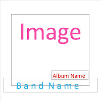
This is the first draft layout for an album cover. The image covers the main section of the page, with the band name being second in dominance. I feel that these are the two main aspects of the CD cover so therefore have made them very large. The Album name is slightly smaller but still of importance, this is situated below the Band Name. Smaller details have no set place, as they may look better in different areas depending on the image used.
This design is similar to the previous, but the Band Name is above the Album Name.


No comments:
Post a Comment